
MeTime Mental Wellness App
A mobile app designed to help users who have a busy schedule allocate time throughout the day for their mental wellness.

Context
MeTime is a mobile app designed to help users who have a busy schedule allocate time throughout the day for their mental wellness. The MeTime App allows users to keep track of their busy schedules and complete mental wellness exercises throughout the day.
Overview
-
Group Project
Designed in 3 weeks (July - August 2022)
Problem
Users who have a full and busy schedule cannot or do not know how to find time to look after their mental wellness throughout the day, even when experiencing overwhelming emotions of depression, stress, or anxiety.
Solution
Conduct user research and testing to develop a mobile app and prototype that assists users with keeping track of their busy schedules while also creating time to complete guided exercises to increase mental wellness and positivity.

Research
Competitor Analysis
Our user research began by discussing different concepts for an app that hasn't been created before. After many suggestions, we used the dot-voting method to settle on one concept. This is how we came up with MeTime, an app for busy individuals that need to make time in their day for their mental wellness. Our next step was to research and analyze direct and indirect competitors for our apps concept. We chose 3 direct (Moodfit app, Calm app, Headspace app) and only 1 indirect (going to the gym). Since there were already very similar existing apps on the market, we felt the direct competitors would help us gain more valuable insight for how we could meet our users needs and make our app the best for mental wellness.
.jpg)
Proto-Persona
.png)
Some things we took into consideration were:
-
people feel they are too busy to make time for themselves throughout the week or on weekends
-
commuting takes up a lot of time in day-to-day lives
-
users want to find a better work-life balance and make more time for themselves but may not necessarily know how
Once we had an idea of what our competitors were like, we developed a survey and shared it with friends and family in order to gain a better understanding of what people's busy lives look like and what they would want and need from a mental wellness app. After collecting the data from our survey, we went ahead and got started on our proto-persona, where we listed out our app's potential user.

User Research & Interviews
Taking the data we collected from our survey, we looked at patterns, key takeaways, and commonalities. We then summarized all of that data and used this to help us create our user research & interview plan. We first discussed what our research goal and objectives were, and then came up with a few questions for each. We felt this would help us develop a better understanding of our user(s) and therefore tackle each objective.

Key Takeaways:
-
68.2% of the targeted participants think that mental health is important
-
Most participants find it difficult to find time for themselves
Objectives
Research goal: Understand the lives of users with a busy work schedule and what they do for their mental health wellbeing during their work day.
As a user researcher, I want to understand what mental wellness means to the user
-
How do you define mental wellness?
-
How do you destress?
-
What drains you the most?
-
What kind of resources do you use to help guide you with your mental wellness? (apps, journaling, etc)
-
What applications are the most used on your phone/tablet and how do you feel after using them?
As a user researcher, I want to understand how users feel during their typical work day
-
What gets you out of bed on Monday morning?
-
Describe some of your emotions during a typical work day
-
How do you know it's time to take a break?
-
What causes you to feel stress at work?
-
How do you maintain a work-life balance?
As a user researcher, I want to understand what is stopping users from doing wellness exercises during their work days
-
How do you check on your mental wellness throughout the day?
-
Walk me through your typical work day - what are your daily tasks?
-
What is your system for prioritizing your tasks?
-
In what ways would you like to implement more down time during your work day?
-
What parts of your job do you enjoy the least?
Affinity Diagram
We conducted 5 user interviews and 4 interview transcripts. After this, we took everything we had from our user research and placed all of that information into an affinity diagram. This gave us a clearer understanding of what is most important to our users when it comes to their mental wellness and what they would like to see in an app.
INTERVIEW #1
INTERVIEW #2
INTERVIEW #3
INTERVIEW #4
INTERVIEW #5


Analysis
User Persona
After our user research was completed, we were able to take all our findings and carry that over into our user-persona. This was a combination of all of the research we had collected, and placed into a single persona - a representation of our target user. From here, we were able to come up with our problem statement and figure out exactly how we wanted our app to make an impact. This also allowed us to create our user insight statement.


Problem Statement
Our user, who has a very busy schedule, needs to find times in the day to focus on their mental wellness when feeling overwhelmed, stressed, or anxious.
Our solution should deliver a way for them to keep track of their busy schedule as well as suggested times to do wellness exercises with guides to decrease stress and anxiety, and increase mental wellness and positivity.
User Insight Statement
Our user, who has a hard time with work-life balance, needs assistance finding times in the day to focus on their mental wellness and be given tools to implement because she wants to feel less stressed and find more time for herself during the day.
Ideation
I Like, I Wish, What If...?
Once we moved onto our ideation stage, we created our "I Like, I Wish, What If?" mind map. We did this by using the data we collected from our user interviews and then made notes from our users perspectives, outlining what they like, what they wish, and answering the question “what if?". This helped us begin creating an app with features users would want to see and use.


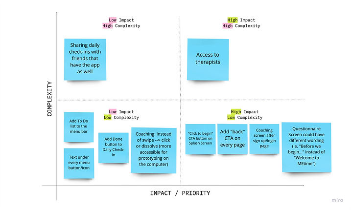
Feature Prioritization Matrix
From here, we took all of our data that we had collected thus far and placed everything into a feature prioritization matrix, where we were able to determine which features were the most and least complex, had the highest and lowest impact, and which were the highest and lowest priority.

Storyboard

In the final stages of our ideation process, we completed a storyboard and user journey map to help us identify what the potential path of our user(s) could look like when using our app.
User Journey Map

In the last part of our ideation stage, we began by creating a user flow to show all of the different potential paths our user could take when using the MeTime app.

User Flow
Information Architecture

Prototyping
.png)
Paper Prototype Wireframes
In our prototyping stage, we sketched out and developed clickable paper prototypes that included UX and UI elements that we wanted to include based on all of the research and analysis we had completed thus far. Once we had a clickable prototype ready, we went straight into user testing.
User Testing
For our user testing, we conducted and recorded a total of 4 user tests, each with 6 tasks for the participant to complete. The majority of tasks received a 100% success rate, aside from one task, which received an 87.50% success rate. This meant that we had to make some iterations to our paper prototype before creating our clickable lo-fidelity prototype.
User Testing Plan

Out of the six tasks, almost all were completed successfully without any difficulty. The only task that was partially completed by one participant was task #1. Despite the majority of the participants completing all tasks successfully, my team and I went over the recordings and notes taken during testing to determine if there was anything else we could improve. After assessing our results, we made the decision to make a few minor changes to our design. In order to determine what was most and least important for editing, we again created a feature prioritization matrix, where we recorded and organized our key takeaways from the user testing sessions.
Feature Prioritization Matrix 2.0
We decided and learned that we needed to make some small changes, such as:
-
Adjusting the splash and coaching screens
-
Change some of the wording on our questionnaire screen
-
Add back buttons to our screens
-
Add a few "call to action" buttons on some of the screens
Once we finished all of the updates, we iterated our user flow and created our low-fidelity prototype using iOS UI standards.
%20(1).jpg)
User Flow 2.0
Low-Fidelity Wireframes

Final Thoughts & Opportunities
In conclusion, we feel our app has really great potential and is incredibly user friendly. For future opportunities, we feel we would like to add a few more features to the app, such as:
-
An explore page
-
This would be a page where users can look through all the different wellness activities and save them to their "like" page
-
-
A blog section
-
A page that showcases blogs that are written by professional therapists and wellness influencers as a resource for the user(s)
-
Additionally, we would want to create a mid and high-fidelity prototype, and continue testing and iterating.