
PeopleDo Health + Wellness

The Original Design
Redesigning the branding for PeopleDo was an enjoyable process. I was fortunate enough to start with a strong foundation, as the original brand already had distinctive colours and a clear sense of identity.
The original website was minimal in design, featuring a single font, a limited colour palette, very few images, and no icons or graphic elements. View the website redesign case study here.
New Colour Palette

My goal was to retain as much of the original palette as possible to maintain brand recognition, while introducing additional shades to create more depth and versatility. However, many of the initial colours lacked strong contrast - especially on light backgrounds - and didn’t meet WCAG accessibility standards. Given how important accessibility is to both PeopleDo and me, adjusting the palette became a top priority.
Through rounds of testing and iteration, I explored various colour combinations and background pairings until we arrived at a new palette that felt both warmer and more inclusive. The final version balances visual appeal with accessibility, reinforcing the brand’s welcoming and supportive nature.
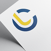
Logo Redesign


Monogram logo was thoughtfully designed to suggest the letters "P" and "D" through abstract form. They also represent speech bubbles of a two-way conversation.
Icons & Illustrations
To align with the warmer tones and inviting feel of the updated branding, I designed custom icons and illustrations with a more organic and neutral aesthetic. The visuals are intentionally abstract, and the characters are faceless. These are choices I made to ensure the imagery feels approachable and universally relatable. The icons were created to be less literal and more intuitive, reinforcing the brand’s thoughtful and human-centred personality. These custom elements feel uniquely tailored to PeopleDo and help strengthen its distinctive identity.


Patterns
Lastly, I designed a series of versatile patterns to complement the brand’s visual identity. These patterns were created with flexibility in mind and are well-suited for use across various applications, such as packaging, and printed materials. Certain variations were also chosen as backgrounds in web design use cases. They add visual interest while maintaining consistency with the overall brand aesthetic.


Lantern Capital


Rebrand
Lantern Capital is a corporate firm specializing in heavy equipment financing, small business lending, and real estate financing. During my time there, I worked on a wide range of design projects. This included designing a SaaS web and mobile application, leading a website redesign, creating social media content and strategy, developing presentations and branded graphics, and contributing to a full company rebrand.


Social Media Strategy
The social media strategy focused on presenting the refreshed brand with a modern and inclusive tone. This included celebrating holidays and seasonal shifts more consistently, highlighting key achievements and milestones, and fostering a sense of community through timely and thoughtful content.


Alter Effects
Logo Design


Alter Effects (or AFX) is an alternative rock band who asked me to design a logo with a unique twist - the only brief was to listen to their music and create something inspired by the sound and vibe. I developed several variations, a few of which are now featured on their merchandise, with the potential for more applications in the future.


Schoolio
Company & Brand
Schoolio is an online adaptive learning platform that allows parents to stay actively involved in their children's homeschooling journey.
When they approached me, Schoolio already had a clear vision for their brand - centred around a fun, child-friendly outer space theme. They wanted to retain this concept while infusing it with playful energy and personality.


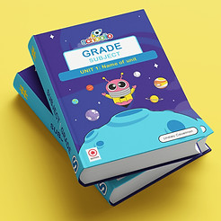


Logo & Characters
At this time, I had been creating cartoon stickers as a hobby, and was using a very bright and bold colour palette. Drawing inspiration from this palette and my signature cartoon style, I was asked to design a logo that resembled these stickers. In addition to the logo, I was asked to create a cast of imaginative, space themed characters, planets, and backgrounds to bring Schoolio's platform to life and make learning more engaging for kids.
While Schoolio has since updated parts of their branding, they continue to use the original logo design, along with many of the characters and background illustrations I created.


Meatsmith
Web Banners
Meatsmith already had an established brand identity, so the next step was expanding on that foundation. As part of their website revamp, they needed a fresh look for their internal pages. I collaborated with a team of designers to help bring this vision to life. My contributions focused on designing custom web banners and illustrations that aligned with the existing brand while elevating the overall visual experience. Below are a few examples of the designs I created.


Social Media Posts
In addition to the website updates, Meatsmith was focused on growing their Instagram presence and increasing brand visibility. As part of the content creation team, I was responsible for designing promotional graphics and advertisements tailored for Instagram. These assets were used across various channels - including direct posts on their page, sponsored ads, and their Amazon product listings.
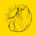
Yellow Walrus
Logo Design
Yellow Walrus Cafe + Bakeshop was a cute, independently owned bakery located in a small Ontario town. I was commissioned to design their logo based on a specific style direction, including the chosen font and colour palette. The final logo was used across various branded materials, including packaging, signage, menus, and merchandise, until the bakery closed its doors a few years later.


All Business Cards


