

Telus Website Redesign
A partial redesign of the Telus website to introduce a new feature allowing users to compare plans.
Context
A partial redesign of the Telus website to introduce a new feature that allows users to compare phone plans and bundles within the website making it easier for users to choose a plan best suited for them.
Overview
Group Project | Designed in 3 weeks (December, 2022)
Problem
Users who visit their service providers website to compare phone plans find it difficult to do so as plans appear limited and/or hidden, and often don't include exactly what they need for the right price. Users would like to easily find a plan that meets their needs while also getting the best deal.
Solution
Conduct user research to understand exactly what users are looking for and what they need in order to optimize the navigation system and user flow to facilitate a smooth, easy, and simple experience for users. This will consist of:
-
Creating a side-by-side comparison of plans and bundles to reinforce that users are getting the best deal(s) for them
-
Effectively summarizing and visually laying out information for readability
-
Optimizing the navigation and user flow to guide users to information efficiently
-
Pair with succinct and clear summaries to lessen the heavy text while still leaving crucial information

Research
Heuristic Evaluation
My group and I began our user research by conducting a heuristic evaluation of some pages on the Telus website. Some important things we noticed were:
-
Hero image/banner needs an update
-
Interactions: hover states are inconsistent, ability to interact is unclear
-
Product/plan cards: inaccessible/
hidden information on plans that are not part of the sale/promotions
-
Colour, images,
contrast all meet
accessibility
requirements
-
Breadcrumbs are
accessible

Proto-Persona
My team and I then moved onto creating a proto-persona to determine what kind of user(s) we felt would most likely visit their service providers website and why.
Some key points we included were:
-
someone who might need a lot of features when choosing a plan
-
saving money - being mindful of expenses and finances
-
someone who prefers to look at all plan options online
-
someone who wants to use the same provider for all services
-
someone who likes animals

After we had a general idea of our user, we began developing a survey to share with the public to acquire a better understanding of what our user(s) might be looking for from their service providers, from their current providers website, what might influence them to switch providers, etc.
Survey Results


Some of our key takeaways included:
-
Top 3 major competitors are Rogers, Bell & Freedom
-
Majority of users visit their service providers website to look at plans
-
Almost all users felt a better plan and/or price would convince them to switch providers
Competitor Analysis
Next, we conducted a competitor analysis to determine and understand what other service providers might be doing the same, similarly, and/or differently.

Key Takeaways:
-
Direct competitors all have consistent branding
-
At least half of competitors lack icons
-
All competitors have simple + clear navigation
-
All competitors display deals on the homepage
User Insights & Interviews
Interview #1
Interview #2

Interview #3

Interview #4

Survey Results

For the final stage of our user research, my group and I created a guerilla testing plan and conducted a total of 4 tests. This was to understand and see where or if users were struggling or having difficulty within the Telus website. We then recorded these results, combined it with our current findings, and organized all of our data into an affinity diagram.
Affinity Diagram

Analysis
Now that user research had been completed, we developed a better understanding of our user(s) and were able to create a user persona and empathy map. These allowed us to define our target user(s) along with their goals, likes, habits, and pains.
User Persona

Empathy Map

Key Takeaways:
-
Users see too many ads on the homepage
-
Users hear that other providers offer more affordable plans
-
Users question where to find specific information and therefore just guess
-
Users feel there are limited plan options


Problem Statement
Our user who is reliant on technology, needs to be able to easily compare features and stay within budget when looking for a phone plan.
Our solution should allow users to compare different phone plans within Telus by creating a plan comparison feature and bundle options.
User Insight
Statement
Lucas, a young computer software salesman, needs to be able to clearly compare phone plans on his service providers website, to get the most out of his own plan while also saving money.
How Might We...?
In the final analysis stage, we created some "How Might We...?" questions to clarify exactly what problems we wanted to target in our website redesign and determine how we might approach these goals.
How might we...

Change the navigation system so users can easily find information on the phone recycling program?
Help users to find the right plan quickly?
Improve the navigation system to avoid clutter on top of the page?
Organize promotions, bundles, and deals to make them more accessible?
Ideation
Feature Prioritization Matrix
After answering our "How Might We...?" questions, we recorded all potential solutions and sorted them into a feature prioritization matrix to determine which features are top priority for both users and for Telus.
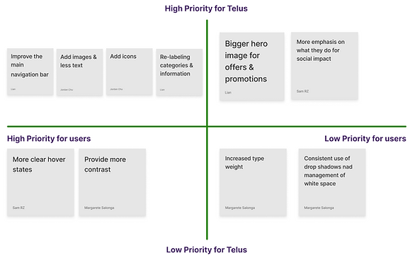
We started with what we learned were the top 4 crucial tasks:
-
improving the main navigation bar
-
adding images and icons to improve accessibility
-
re-labelling categories and sections to improve information accessibility
-
creating a new feature that compares plans directly and also offers bundles to provide easier access to existing offers, services, and plans
Value Proposition
We created a value proposition canvas to outline how our new design and feature can target users wants and needs, while also relieving their pains and frustrations. At the end of this stage, we realized that rather than creating clever marketing strategies, our main focus needed to be finding a way to communicate the existing products through our design - which also needed to be clear, simple, and accessible.


Storyboard
We then created a storyboard to show the following:
-
how simply our user could interact with our new design and feature
-
how easily our user could choose a plan best suited for them
Card Sorting
Next we moved onto card sorting to address the organization and order of content on the homepage. Once this process was done, we noticed that there wasn't any misplaced information across categories; however, we thought it would be better to split the products and services items to make it easier for users to search for plans and phones.


User Flow
We also created a user flow that outlines the process in which all users would go through if they choose the Build Your Own Plan feature. Through 4 simple questions, the user is directed to a plan that best suits their needs.
Prototyping
UI Style Guide
When creating our UI Style Guide, we decided to keep everything original and true to the Telus brand. The only difference was ensuring all UI elements were continuous and consistent throughout the site as this was something we noticed was lacking when we conducted our heuristic evaluation back in the research phase.


Low-Fidelity Wireframes
We created low-fidelity wireframes for some of our screens to ensure we were on the right track with simplicity, consistency, and accessibility.
Mid-Fidelity Wireframes
Once we decided on a layout design, we were ready to create our mid-fidelity wireframes - we would later use these for user testing. Since we created 2 design flows (see A/B Testing below for more info), we also created 2 prototypes.


User Testing
A/B Testing
Before we began user testing, we had a few design ideas in mind that we needed to test. Some of the questions we had were:
-
Do we want our users to complete the questionnaire feature and then be immediately directed to the bundles screen?
-
Would we need a screen in between? Would we need multiple screens in between?
-
How do we want to introduce the bundles after the user had taken a questionnaire regarding plans?
-
Is this confusing for our user(s)?
-
Do we need to show our user(s) what plan options are best suited for them before showing them bundle options?
In order to answer these questions, we came up with 2 design solutions; Design Flow A & Design Flow B. The difference between the 2 flows is the addition of the "Recommended Plan(s)" Page in Design Flow B and the option for the user to select their preferred plan from their results before being directed to the Bundles Page. These results are tailored to the user and are based on how they responded in the “Build Your Own Plan” questionnaire. In order to show the difference between the 2 design flows, we used our original user flow and then created a second user flow to illustrate Design Flow B.
Design Flow A

Design Flow B
.jpg)
We then created prototypes that followed each of the design flows. After this, we conducted 4 unmoderated A/B tests. These tests provided us with very valuable feedback and revealed that Design Flow B was highly preferred.
Iterations
Now that we knew which design flow worked best, we needed to make other necessary UX/UI element changes that were highlighted through A/B Testing. These included:
-
Slowing down the speed of our hero image/banner animation
-
Changing the size of our pop-up questionnaire + adding an exit button
-
Adding a landing page to the questionnaire
Iteration 1
Before

After

Hero Image/Banner Animation


Why We Changed It:
Initially, we had an animation running as our hero image/banner on the homepage. After testing, we discovered the animation was too fast and needed to be slowed down. Instead of changing the speed, we opted to remove the animation entirely. We felt the animation took away from our feature and made it difficult to notice.
We also added a small clickable option underneath our "Start Here" call to action button. This allows users to skip the questionnaire altogether and go straight to the bundles page.


Iteration 2
Before

After

Why We Changed It:
Something else we noticed after testing was that our questionnaire felt more like an overlay on the same page rather than a pop-up. Since it was difficult to notice that there was a difference (or that it was a pop-up at all), we made it slightly smaller and added a dark background. We also felt the dark background helped to draw focus.
We also added an exit button to all questionnaire screens so that users have the option to opt out of the survey at any time, should they change their mind.


Iteration 3
Before

After

Why We Changed It:
Our final iteration was the addition of a landing page for the questionnaire. We realized that once users clicked "Start Here" from the hero image, the questionnaire would begin immediately with no introduction. In order to make this process feel less abrupt, we added a landing page to prepare users and let them know exactly what they clicked on.
High-Fidelity Wireframes
Homepage

Homepage with Questionnaire Overlay

Questionnaire Overlays


Results Screens
Results Screens


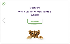
Bundles

Summary


Final Thoughts & Opportunities

Although some of our initial ideas didn’t make it into the final product, my team and I are proud of the redesigned interface and new feature we delivered.
One of our main challenges was staying focused on the feature itself rather than exploring marketing ideas that were ultimately out of control and dependent on Telus’ internal teams. Still, we made a strong effort to understand our users and design a solution that feels simple yet impactful.
We also worked hard to keep our personal biases in check, focusing on what users - not just ourselves - would want from a Canadian phone provider.
With more time, we would have liked to build out a more comprehensive navigation system that included elements from both the primary and secondary menus - something to revisit in the future.